Day#2: Programming Log - 'box-sizing: border-box'


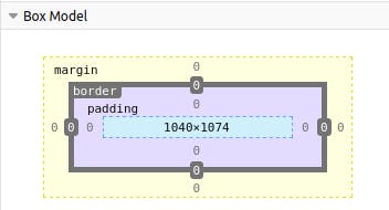
In CSS, elements are made of the content box itself, as well as the padding, border and margin.
You can see the classic box model applied to each element when you hover over to inspect:
box-sizing: border-box allows you to change the box model so that the borders and padding are no longer added to the total width and height that we specify.
scale {
      width: 500px;
      height: 50px;
      background: #615756;
}

.content-box {
     width: 500px;
     padding: 25px;
     border: 5px solid red;
     background: #4dfff3;
}
Despite my content-box element being the same width as the scale element, the padding and border properties will add an extra 30px (25px from the padding and 5px from the border) on all sides of my element, making it larger and giving it a notable stretch to the right:
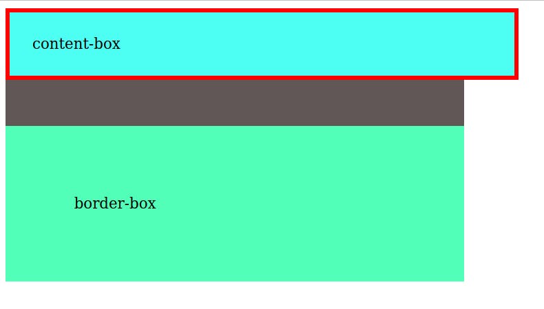
The border-box element, however, gives a different story:
.border-box {
  box-sizing: border-box;
  width: 500px;
  padding: 75px;
  background: #52ffb8;
}
You can see we've now applied box-sizing-border-box . The width is consistent with the other two elements and although there is more padding on it then the content-box, it becomes part of the total 500px width and instead stretches vertically as there are no height restrictions imposed.
In conclusion, box-sizing-border-box allows you to adjust the total width and height, while keeping the padding and border inclusive, so you don't have to worry about factoring in their additional lengths.